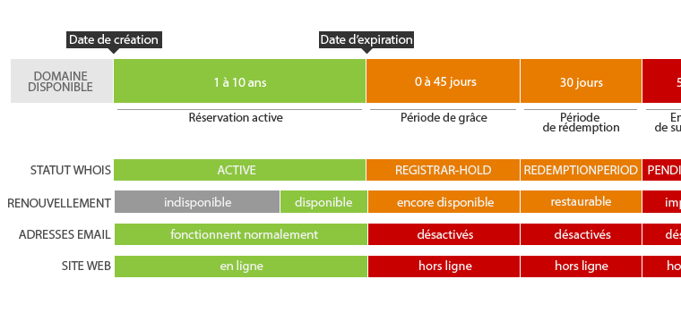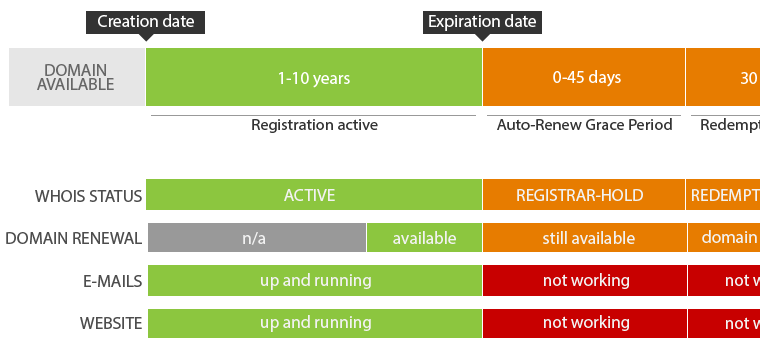
There are a lot of diagrams out there that explain visually the life cycle of gTLD domain names like .COM. You might have already stumble upon the ICANN’s domain name life cycle diagram ?
I wanted to try something less detailed and add some information on how the email accounts or the website are affected throughout every stage in the life of a domain name.
I got inspired by these graphs that consist of red, orange and green coloured bars that indicate respectively the busiest, less busy and least busy hours to go to the post office.
As for my graph, the green colour means that the domain name is registered and active, the orange colour suggests some degree of danger or attention needed (for example, the domain has passed his expiration date, but it could still be renewed) and the red colour indicates that something is already wrong (for example, the website is off-line or it is too late to renew the domain).
All suggestions to improve the diagram are welcomed !